
Your cart is currently empty!
Maximizing Shelf Appeal: The Science of Cannabis Packaging Design
By
.

With more brands and SKUs than ever before, your packaging is often the first and only chance you get to make a lasting impression. That reaction isn’t random. It’s rooted in psychology, and when it’s done right, it draws attention and drives sales. Understanding the psychology behind packaging design helps brands build trust, guide customer behavior, and stand out in a competitive market.
In this blog, we’ll explore how to use design principles with intention so your cannabis package works for you.
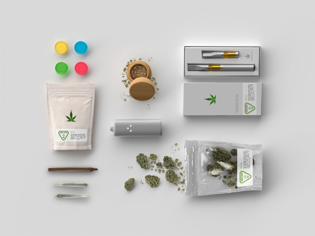
Color Psychology in Cannabis Packaging
Color is a form of communication. In packaging design, color can influence how a customer feels about a product before they ever read the label. It’s one of the quickest ways to convey mood, purpose, and identity.
For cannabis brands, using color intentionally can help create a more intuitive connection with the consumer.
- Greens & Earth Tones: Often signal wellness, calmness, and a natural approach. Great for CBFD products for calming flower strains.
- Black & Metallics: Give off a premium, high-end feel. Perfect for connoisseur or limited-edition lines.
- Pastels: Might evoke relaxation or subtlety. Works well with microdose products.
- Bold Hues: Energizing and suggests a fun, social vibe. Sounds like a sativa to us.
However, there’s also the compliance factor. Many states restrict colors or design elements that might appeal to children, so it’s important to work within those guidelines without losing your personal brand.
Typography, Layout, & Readability
Typography might seem like a small detail, but it plays a big role in how your brand is perceived. The right font can project confidence, professionalism, and clarity, while the wrong one can make your product look disorganized or untrustworthy (Comic Sans, anyone?).
Clean, legible fonts in a thoughtful hierarchy help guide the customer’s eye to what matters most: your brand name, product type, potency, and key details. A well-organized layout reduces friction, especially for new or cautious consumers who are still getting familiar with cannabis terminology. When people can quickly understand what your product is and how to use it, they’re more likely to buy and more likely to come back.
Cluttered packaging, on the other hand, can overwhelm or confuse shoppers. Too many fonts, inconsistent sizing, or busy graphics can make your product feel less polished and harder to trust.
Shape, Texture, & Material Cues
How a package feels in the hand can influence how people feel about the product inside. That’s the power of tactile design. Shape, texture, and material choices all contribute to how a consumer perceives your brand before they even open the product.
Sleek, structured packaging often signals precision and quality. Rounded edges or soft-touch finishes can create a sense of calm or luxury. Embossed logos or foil accents add a tactile richness that says, “This is a brand that pays attention to detail.” Even the way a box opens or closes can impact perceived value and user experience.
Then there’s the psychology of shape and proportion. Smaller, compact packaging can feel more personal and premium, while oversized or awkwardly shaped containers can feel wasteful or cheap. The goal is to create something that feels intentional in both form and function.
Emotional Triggers & Brand Personality
Design elements like tone, color, texture, and iconography all work together to reflect your brand’s personality. A minimal, nature-inspired design might speak to wellness-focused shoppers. A bold, modern look could appeal to experienced consumers looking for innovation. The packaging should make someone feel like your brand “gets” them.
Even the smallest details contribute to that emotional resonance. A clever strain name placement, a reassuring tagline, or thoughtful icons can make the experience feel personal. And when it comes to cannabis, emotional clarity matters. People want to feel safe, informed, and excited about their purchase, not confused or uncertain.

Consistency Builds Trust
Consistency across your packaging lineup helps customers recognize your brand instantly, no matter the product or format. And in a crowded, fast-moving market, that recognition is key. When your flower jars, pre-roll tubes, and edible pouches all speak the same visual language, you’re reinforcing your brand’s credibility.
It shows that you’re organized, intentional, and reliable. On the shelf, that consistency reads as quality. In the consumer’s mind, it builds confidence and trust.
The Vertical Supply Effect: Design with Intention, Deliver with Impact
Cannabis packaging is your brand’s handshake, voice, and first impression all rolled into one. When designed with intention, packaging has the power to influence behavior, build trust, and leave a lasting impact.
By tapping into the psychology of design, your packaging can do more than meet compliance, connect, and convert. It helps your brand stand out for all the right reasons.
Ready to design packaging that works as hard as your product does? Partner with Vertical Supply to create compliant, thoughtful, and visually compelling packaging that tells your story and wins customers at first glance.
Leave a Reply